As part of my Master’s thesis with the title Conception, Realization and Evaluation of Multi-Touch Interfaces for Interactive Visualizations, there has been the goal to create an interactive visualization that can be used via multi-touch. Finally, this visualization should be evaluated, which means it should be thoroughly tested and there should be some results in numbers.
Videos:
Vispol on Sensory Mind‘s Round Table:
Paper: Read a summary about Vispol in this paper.
Desktop version:
Try out Vispol (Flash necessary)
Background information:
This multi-touch visualization should be different from the common multi-touch use cases scaling/rotating images and zooming in maps. Additionally, this visualization should have a dedicated use and should not just be a prototype that demoes basic multi-touch capabilities.
I have been intrigued by the interactive visualizations in Minority Report, which provided natural user interaction for profiling activities of a policeman in future.
Minority Report is (still) science fiction and I doubt that the kind of gestural interaction like it is being performed in this movie is really usable. However, the idea of a visual tool for the police that helps to analyze critical situations like murders or special situations like bank hold-ups or hostage takings is fascinating.
By chance I have had the oportunity to meet an executive of the police of the state of Hessen, who collaborates with the visualization professor Prof. Dr. Ralf Doerner at the RheinMain University of Applied Sciences. This police executive is responsible for the coordination of special situations like the introduced cases bank hold-ups or hostage takings.
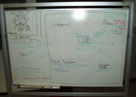
In such situations a police crew will gather in a room in the police facilities that is fitted with special equipment. This crew coordinates the activities of the local police on-site of the special situation. The police makes use of quite a lot of specialized software to collect available information throughout a special situation in a central database. However, the police of Hessen has not been been using a dedicated application for the visualization of information about involved persons. Instead they have utilized a whiteboard, which is crammed with information after five persons have been added:
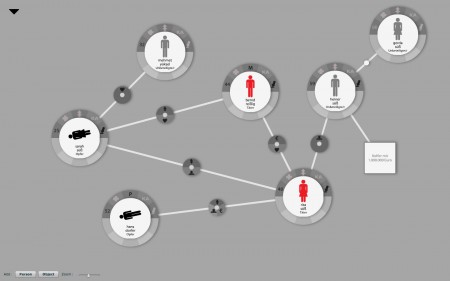
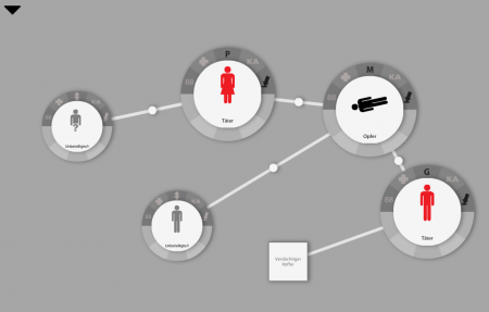
To solve these problems we developed a software called Vispol (Visualization for the police): It provides the possibility to collect information about involved persons and objects of a special situation in a visual manner.
Vispol visualizes dangers of a special situation to the police officers and enables a quick introduction of a special situation to persons that are new to the situation.
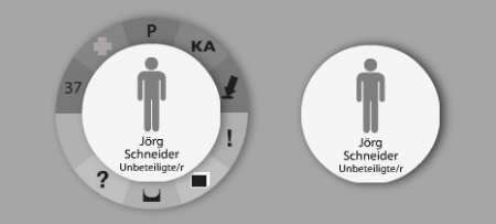
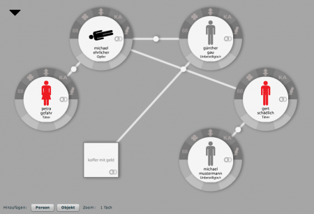
In Vispol a person is represented by a circle and an object is represented by a square. Persons can be connected with other persons and objects and vice versa. A person consists out of a central circle and ten wedges around this circle. The central circle contains information about the type of person (culprit, victim, not involved), the sex and the name of the person. The upper five wedges can hold information represented by an icon about the age, the health state, the armature, a potential criminal file and the whereabout of the person. The lower five wedges can hold various information like notes, questions or photos of the person:
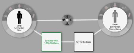
An object can have a name, a whereabout and a color.
A connection between two persons can have up to four attributes: an emotional relationship, a related relationship, a crisis in the relationship and/or a business relationship. Connections between persons and objects and objects and objects cannot have attributes.
Additionally, it is possible to apply layout algorithms to a Vispol visualization that help to analyze the situation. Currently, there are three layout algorithms:
- A circle layout arranges persons and objects in a circular fashion.
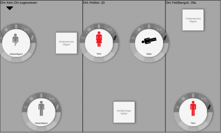
- A whereabout layout orders persons and objects according to their whereabout.
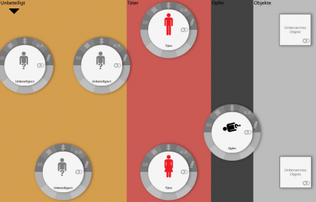
- A type layout sorts persons and objects according to their type (culprit, victim, uninvolved, object)
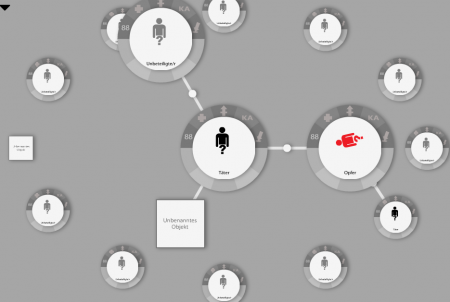
- A move to center layout moves a person in the center and arranges the persons and objects that are connected immediately to the person around the person.
- A highlight weapon layout shrinks persons that do not carry a weapon.
An example for the circle layout (1.):
An example for the whereabout layout (2.):
An example for the type layout (3.):
An example for the move to center layout (4.):
An example for the highlight weapons layout (5.):
Vispol is written by me in Adobe Flash Actionscript 3 and Flex. It makes use of the excellent data visualization framework flare from Jeffrey Heer for Actionscript 3.
The fabulous design has been conceived by Melanie Seyer. With her I accomplished the digital volvelles project earlier on. Many icons have been dictated by the police as they had their own symbols for many purposes. Thank you very much, Mel!
The police would like to use use this visualization in their special situations facilities via a projector to model and to discuss situations:
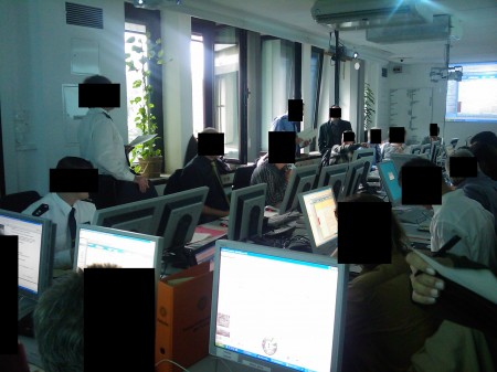
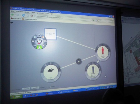
In terms of my thesis Vispol is completely usable via multi-touch.
⇾ Additional information about the multi-touch functionality of Vispol.
In another Bachelor’s thesis Vispol a tangible user interface for Vispol has been complemented by Frederic Frieß.
⇾ Additional information about the tangible user interface functionality of Vispol.
You will find more comprehensive videos of Vispol’s multi-touch functionality here and of its tangible user interface functionality here.
